2019-2020 Erin Condren Life Planner
Find the NEW 2021-2022 ECLP Below!
I am so excited to be sharing about the brand new 2019-2020 Erin Condren Life Planner! There is just something about a brand new planner that I love. I started using the Life Planner back in 2014. We were getting ready to welcome our third little one into the world, and I needed something else to help keep me organized.
This post includes affiliate links. If you click on one of these links and make a subsequent purchase I may receive a commission. Read Disclosure.
Paper planning has always been my jam. In high school and college, I thrived with a paper planner. Writing down everything became the best thing for me. I tend to think about a lot, and when I write it down it is almost like giving myself permission to let that go. You don’t have to work so hard to remember everything when you write it down. At that point, I had been using my own daily docket system that I created, which was helpful, because I am a list maker, but I needed more of a calendar system. When I saw the Erin Condren Life Planner, I fell in love with the colors and the quality, and immediately started my planning journey.
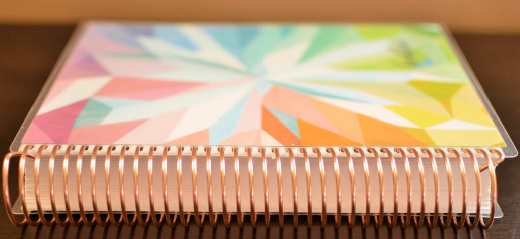
Erin Condren Life Planner: the Choice
It used to be that when you purchased a Life Planner, you had one option – the classic colorful vertical planner. However, now there are an entire array of products that you can choose based on your own individual needs. I always get a vertical planner. I love it, it helps me block my time, and it is what I am used to. A few years ago they came out with a horizontal planner, and I thought I might like that better, I did not. I think in lists, and so the vertical helps me with that.
There are a lot of different choices now. You can choose from:
- horizontal colorful
- horizontal neutral
- hourly colorful
- hourly neutral
- vertical colorful
- vertical neutral
Then you can choose your calendar start time:
- academic – July 2019-June 2020
- the calendar year – January 2020-December 2020
- 18-months – July 2019-December 2020
Finally, you can choose your personalization:
- Black Coil
- Gold Coil
- Platinum Coil
- Rose Gold Coil
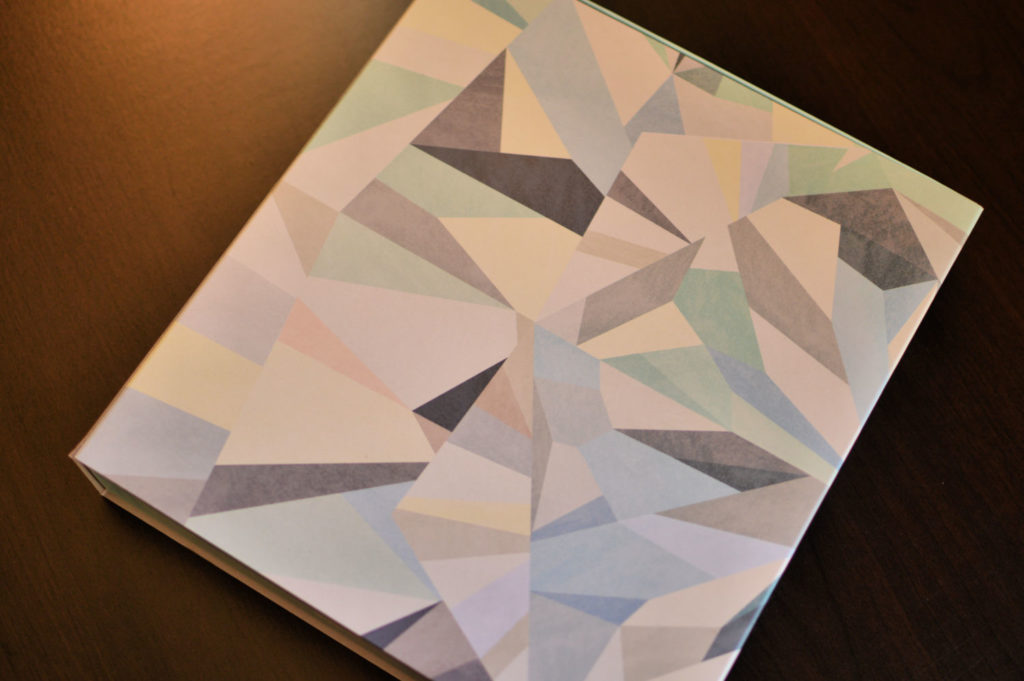
And brand new this year – a binder system. The binder system also comes in the same layouts as the coiled life planner. Depending on how you plan would determine which planner you will choose. I like the ability to fold up my planner and bring it with me places, so I use a coiled planner. I already use a homemaking binder, but that is completely different to me for other planning/organizing purposes.
This year I chose the 18-month vertical neutral Erin Condren Life Planner with a rose gold coil. If that isn’t a mouthful, I don’t know what is!
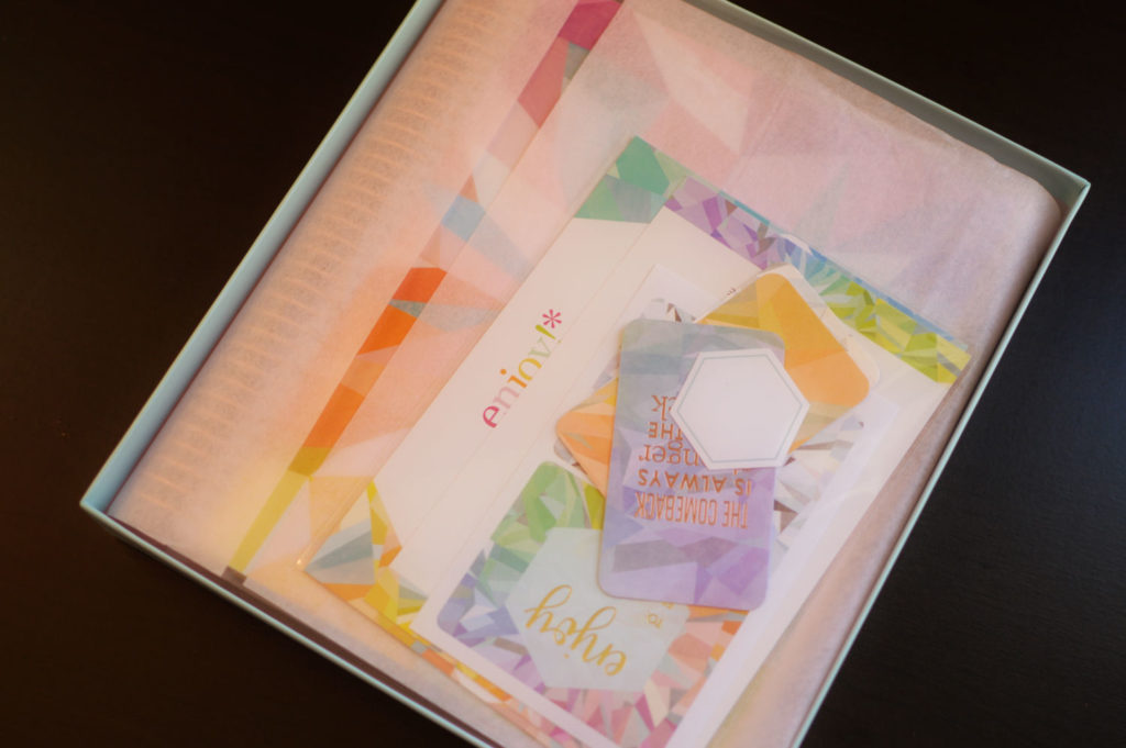
When the Box Comes
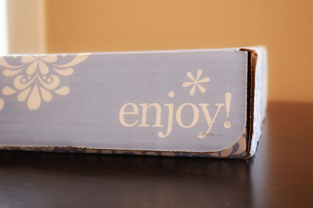
When you order an Erin Condren Life Planner it comes in their classic designed box. You always know when your order arrives because of the pretty box sitting on your steps! New this year is that the life planner also comes in a decorative storage box. The box is different depending on whether you choose neutral or colorful. The box is quite pretty, but not all that sturdy. I believe the plan is that it would be a storage box for your life planner after the year is finished. I don’t usually keep my planners on a shelf, instead, they end up in a memory box in our attic, so I’m not sure I will be keeping the box.
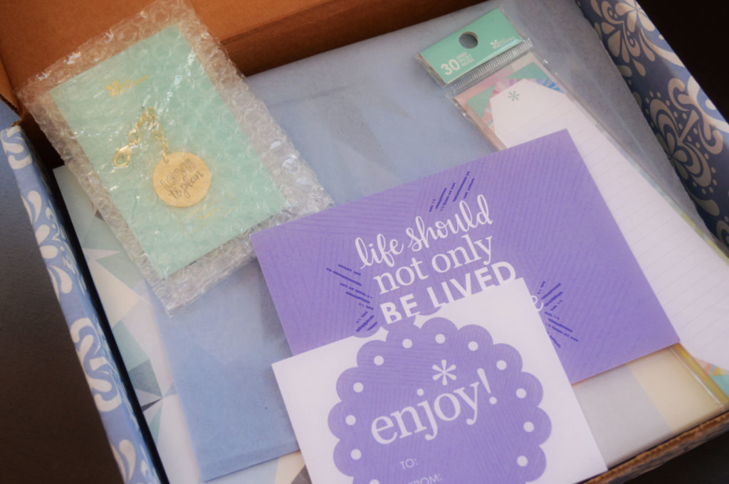
The box also replaces the little plastic pouch that used to come with the planner. You still get the little goodies that Erin Condren always sends, but they come packaged differently. I don’t regularly use the plastic pouches, instead I have a zippered pouch that I keep my pens in and a little folder that my stickers stay in, so I wasn’t too bothered that they switched it out. The bottom of the box is a bit sturdier than the sleeve, and it might make a good place to store paper.
The planner also comes with a ruler that has been completely redesigned this year. It is a little more flexible, and also wider. I haven’t used the ruler in the past because the teeth tend to break when I am snapping it in and out of the planner itself. It definitely seems higher quality now and less likely to break.
Opening Your Erin Condren Life Planner
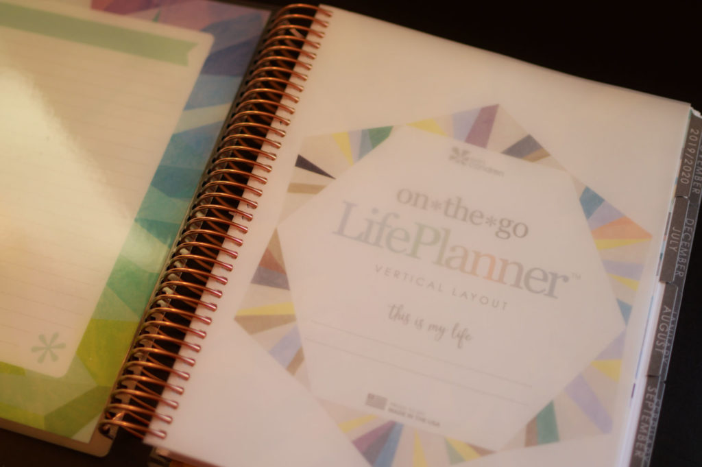
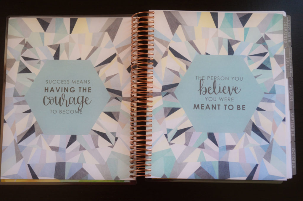
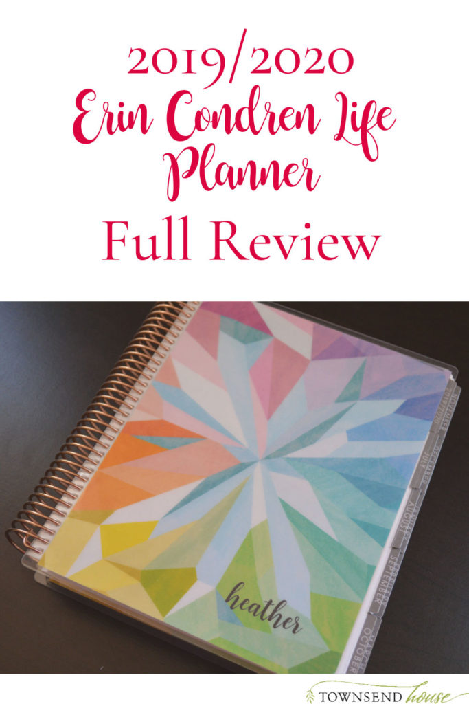
The first thing you see when you open your life planner is your removable cover. On the inside of the cover is a dashboard that you can use however you choose. I don’t ever use the inside cover dashboard, but I know a lot of people will list things here. Then you will come to the vellum page. It is a really nice touch that they added several years ago. Then you will get to the first quotes pages. Each year Erin Condren chooses a new design for the year, this year the design is a kaleidoscope style. When I first saw that, I thought it was going to be too busy – this is part of the reason I stayed with the neutral this year!

The first quotes page is very pretty, but it is definitely a little loud for my taste. The colors are beautiful, and the design is well done, but it isn’t as much to my liking. It is much more understated for the monthly quotes, and I think it is beautiful there. Just a touch of the kaleidoscope design. In the neutral, the colors are much more muted, and it is a beautiful blend of soft pastel colors mixed with different grays.
Almost immediately, you will notice the quality of the paper. This is one of the reasons I keep coming back to the Erin Condren Life Planner year after year. The quality of the paper and the coil are out of this world amazing. The pages are a really thick paper that doesn’t have shadowing when I am writing, and it has such a lovely feel to it. And the coil is the best that I have seen, sturdy, and everything stays together. Obviously very important in a planner!
Planner Prep
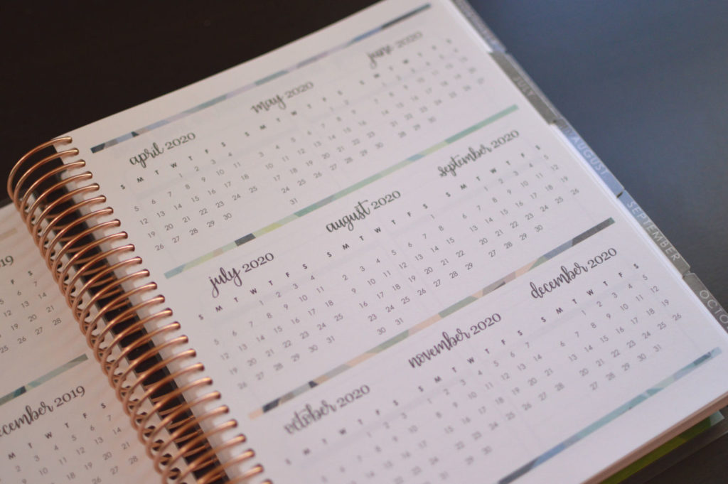
There are not a lot of prep pages at the beginning of this planner. It is very streamlined. You move right into the 2019-2020 mini monthly calendar spread. You can use this any way that you like. I use it to track vacation days, holidays, and birthdays with different colored mini circle stickers. You can also track bills, paydays, or your monthly cycle. I didn’t use these pages for several years for anything other than reference, but last year I found it useful to start color coding everything.
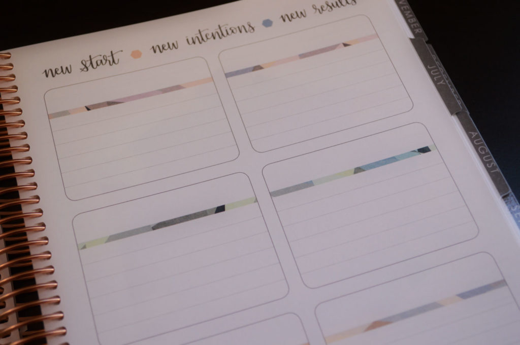
The next set of pages is 12 boxes which can, again, be used however you would like. I tend to use these pages for either monthly goals, or projects we are working on. It is also a great place to write out big purchases you have in certain months. They are lined this year and have headers for each box separated by a thin strip of the kaleidoscope design. This is what I love to see. The planner itself is quite neutral, but there are still little pops of color here and there. That is part of the reason I love the Erin Condren Life Planner so much – it is still beautiful, even when you want a more neutral version.
New Monthly Spread
After the two page spread of boxes, you will move into monthly calendar section of the planner. The first page is a notes page. I am not as good about using the notes pages in my planner. I am a pretty functional planner, and so I mainly use the monthly and weekly calendar portions. However, there are times that I want to write things down about the month ahead, and this is a perfect place for it. It would also be perfect for memory keeping about the month. The opposite page is your monthly quotes page.

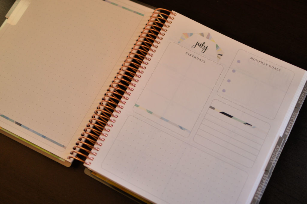
When you flip to the next page, you see a completely new spread this year. On the left side, you have a dot grid page (or a blank dashboard if you purchased the colorful version). On the right side, there is a page that has a box for birthdays, a box for monthly goals, a box with some lines, and then another box of dot grid on the bottom of the page. Originally I thought the dot grid section on the bottom would be good for a monthly tracker, but it doesn’t have enough space. But, as a PowerSheets user, I could see using this for monthly progress tracking if I didn’t want to use my tending list. And I could actually use the dot grid page for my tending list.
Monthly Calendar
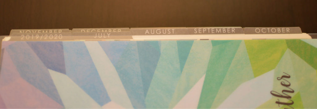
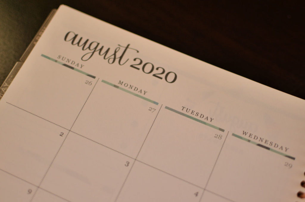
The next set of pages is your monthly calendar portion. There is a little bit more color with small strips of the kaleidoscope pattern under the days of the week, but it is very neutral, which is what I love. The colors of the text have lightened up – in fact, the tabs that lead to the calendar portion have also lightened. Instead of the black that they used to be, they are more of a gray color. They have taken out the mini monthly calendar that used to be at the bottom of the page under the notes column. It is nice to have a little extra space for notes, but having that next month viewable while on the previous month was nice. I liked not having to flip to the next monthly calendar spread to quickly see days.
Weekly Calendar Spreads
Then we move into the guts of the planner – the weekly calendar spread. The weeks go from Monday-Sunday, which is nice because I think of the weekend as its own unit, and Monday is the start of our week. The planner does look quite a bit different, and there were some big changes from last year.
The first thing that I noticed was actually that the boxes for each day are not separated like they were last year. Each day is more connected. There were no headers in the neutral planner last year, but this year there is one header at the top and then one small header at the bottom where the little lines are for your “extra” of the day. I am a pretty visual person, and what I actually noticed was that the boxes don’t appear to be the same size throughout one day. So I measured. The top box (minus the heading) and the bottom box for each day are 2 inches, which is what all the boxes were in previous years. But, the middle box is a little bit bigger. It is 2 1/8 inches.
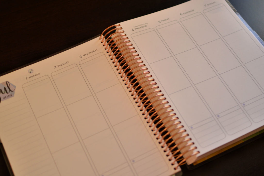
Not a huge deal, but it is a little bit off for me visually.
They have added in a mini monthly calendar at the bottom of the notes column. This is unnecessary and slightly redundant to me. I would have preferred that the mini monthly calendar was on the monthly calendar spread.
Overall I will continue to use the three boxes in each day the same way that I always do, regardless of the odd top header, but I do prefer the design of the boxes last year over this year’s changes.
The End of the Planner
Once you get to the end of the weekly and monthly spreads you will come to some notes pages. There are 4 lined notes pages, 4 dot grid notes pages, 2 coloring pages, and then a new hexagon page. I wasn’t entirely sure what this page would be used for. The Inkwell Press Planner has a similar page that is used for monthly mission mapping. Essentially this is monthly goal planning and each hexagon is broken down into different categories – me time, health, dream big, home, financial, etc.
I think that you could certainly use this page in the ECLP for yearly mind mapping if you want to write broad goals for next year. This would probably be good for more long range big goals since there is only one page of it. Otherwise, it is more or less a decorative page that I’m not sure what you would do with.
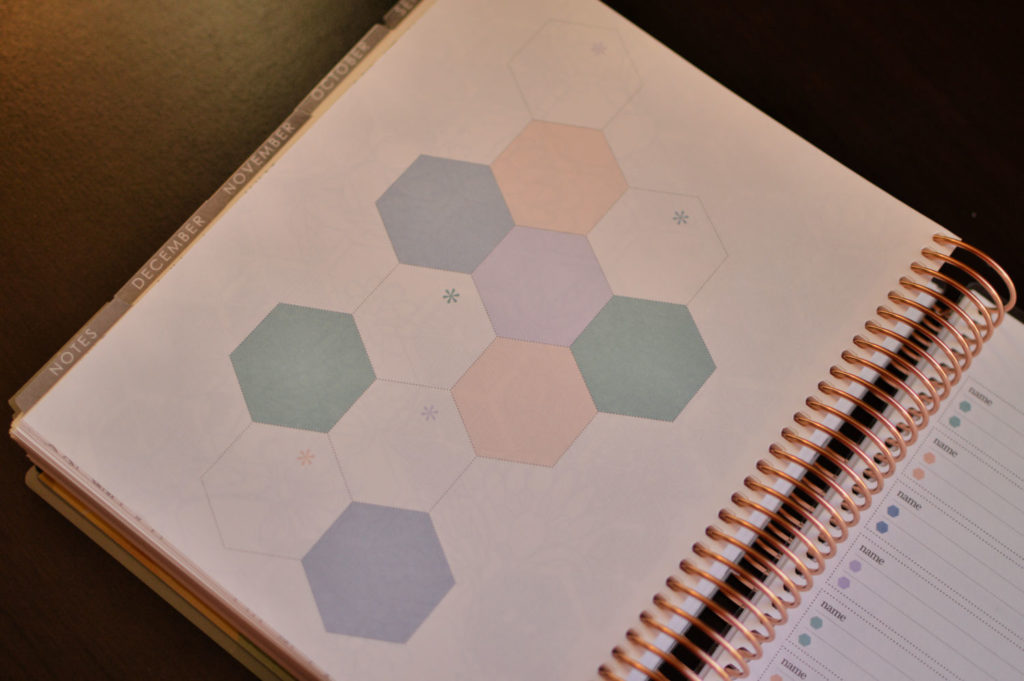
The following page is a contacts page. You can write down some important numbers that you want to have access to – doctors, your child’s school, dentist etc. After the contacts page you find your future planning pages for 2021 – which I can’t even think about right now! That seems so far away. These pages are useful if you have appointments or events that you have planned out really far in advance.
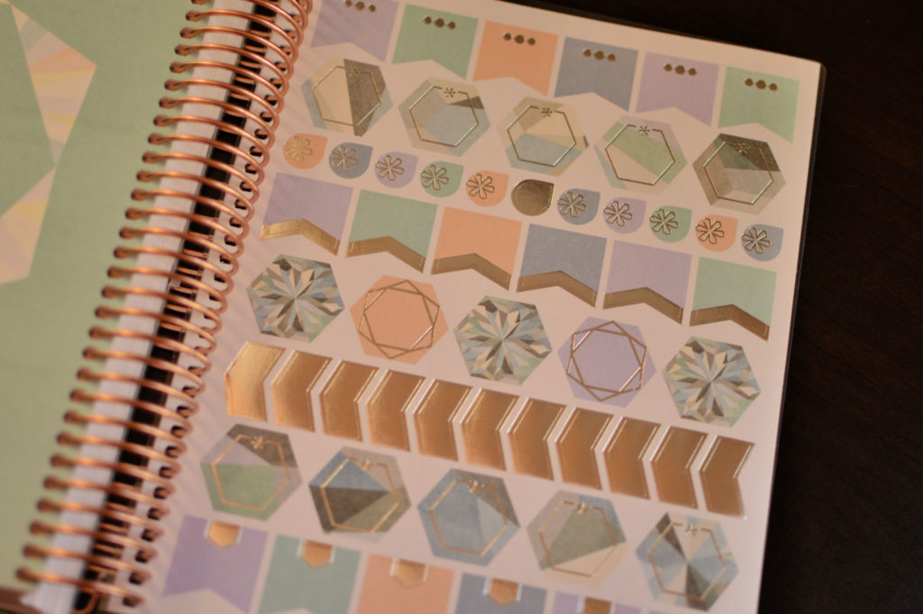
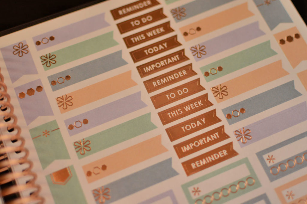
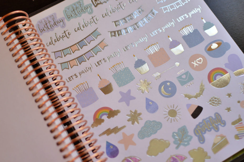
Finally, you come to the sticker pages. This year the coiled in sticker pages are different based on whether you choose a neutral or colorful planner. The stickers are always high quality and beautiful, and it is nice that the color scheme is different based on the colors in your planner.
The Bottom Line
I really love the planner this year. Some of the changes were a little different, like the weekly planning pages. I think that it will still work exceptionally well for how I plan. The way that I use the boxes is to have the top box as to do, the middle box as to go, and the bottom box as to create. It is easy for me to make my mini lists in here, and have appointments etc. at the ready.
The colors are very beautiful, and I like that there are little pops of color throughout the planner. I want the neutral planner, but I still like to have little pops of color. It is what drew me to Erin Condren to begin with!
The Erin Condren Life Planner is available to order TODAY! So definitely don’t delay. If you haven’t purchased a life planner before, you should definitely SIGN UP for a new account first. They will e-mail you a code for $10 off your first order.
Have you tried the Erin Condren Life Planner before? What are your thoughts on the new design? And more importantly, are you getting one for yourself?


I love the 2019-2020 kaleidoscope design…. I am using the hourly for the third year in a row (having used a neutral one year and a colourful the next) this year I’ve gone back to the neutral and I gotta say I love all the changes!
I love the neutral! I haven’t tried the hourly before, but now I am using the vertical and then have the undated petite daily for my busy days…which seem to be a lot of them lately!
This was a very helpful review! I love planners and I’m looking for a new one. I’ve never tried Erin Condren yet. 🙂 Thanks for taking the time to write this detailed review!
I’m glad it was helpful to you! I love the Erin Condren products – they are really high quality and stand up to a lot of my abuse as a mom and homeschooler who is constantly on the go 🙂 I would love to hear what you use for a planner!
I’m currently using a Bloom academic year daily planner, but it ends in July. I entered your giveaway for an Erin Condren teacher planner. 🙂